Total brand renewal
Diagnostic, strategy, positioning.
Vision, mission, values, definition of expertise.
Operational pillars, quality policy, leadership commitments.
Brand architecture, graphic identity.
Donor centre branded design.
Brand council, training workshops.
“I strongly believe the renewal of our brand is an essential ingredient to the execution of our strategy. It gives us an opportunity to articulate a single, unified direction for our organization and its future.”
After two decades
Canadian Blood Services took over from the Red Cross in 1998 with responsibilities that today include the collection and supply of blood and derivatives such as plasma, a comprehensive stem cells network and a nationwide registry for organs and tissues.
However, a majority of the population still remains unfamiliar with the organization, its medical and scientific expertise, or its extensive partnerships within the Canadian health system.
Opportunity to refocus
When the leadership decided to refocus the brand for Canada’s future needs, they opened a national RFP that Cohesion won, having been judged to be an agile, competent partner with whom they could readily collaborate.
Our initial diagnostic clearly demonstrated that this renewal would have to be profound. The task for Cohesion was therefore to develop an all-encompassing solution for the brand at all levels.
Full brand rejuvenation
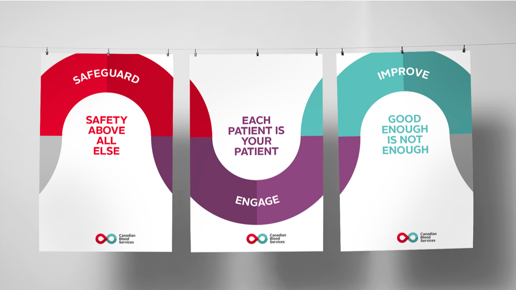
We began by reconceiving the vision and mission statements and initiated an employee survey to determine ethical values. We then innovated the concept of operational pillars, which became the core of our revised quality policy and leadership commitments.
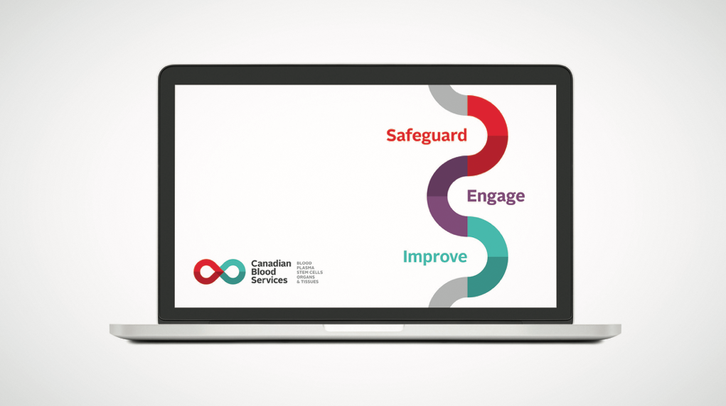
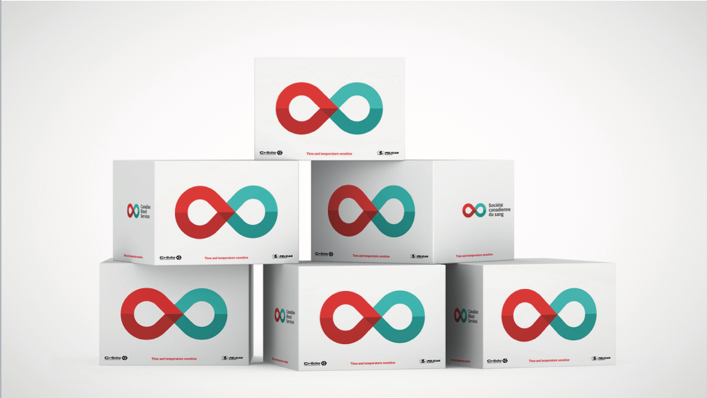
The complex brand architecture was restructured under a single master brand system and with this as foundation, an impactful graphic identity was created working in close partnership with Compagnie et cie. Moving forward, we restructured the website and redesigned the donor centres to deliver an on brand experience.
All factors were extensively researched during development and the rejuvenated brand was successfully launched nationwide on the 20th anniversary.
Research: Ipsos
Visual identity, applications: Compagnie & cie


