Diagnostic. Positioning.
Product portfolio organization.
Visual identity and packaging.
Brand book.
The forgotten story of a pioneering microbrewery
Belle Gueule is a first-generation microbrewery.
Three friends, bar owners on the Plateau-Mont-Royal, decided to join forces in 1988 to dare to challenge the commercial beers dominating the Quebec market at the time. They founded a Quebec microbrewery and launched Quebec's first microbrewery lager, Belle Gueule Originale. They chose the name Belle Gueule for its irreverent attitude. It represented their rebellious, independent spirit.
Growing competition
Over the past 30 years, the number of microbreweries has skyrocketed, products have multiplied and competition has intensified. To plan for the future, Brasseurs RJ commissioned Cohésion Stratégies to carry out a complete diagnosis and reposition the brand.
A brand to be rejuvenated and rediscovered
Cohésion undertook a diagnosis including all perspectives: management, retailers, sales people, marketing experts, and consumers.
The findings were clear: Belle Gueule was struggling to develop a new pool of young drinkers, as those still loyal to the brand had aged with it. The product portfolio is considered attractive, but does not attract attention. Belle Gueule is perceived as a commercial beer, rather than the microbrewery it is.
Cohésion proposed the signature "Proudly independent since 1988" to give Belle Gueule the legitimacy to build on its evolution in its segment.
A positioning that celebrates the art of taking it slow
Microbrewery drinkers want a brand that offers a point of reference: a great classic, for simple, relaxed moments. Cohésion therefore created the positioning Le goût de prendre son temps (the taste of taking time), anchored both in the moment of consumption and in the philosophy of the product: lagers brewed over 21 days.
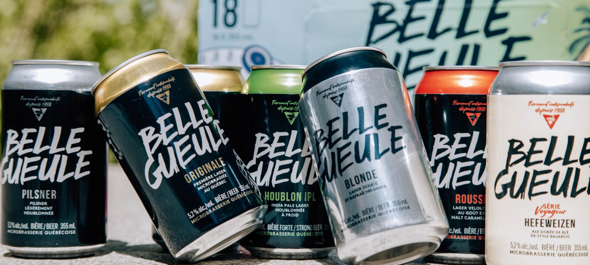
A reinvented visual identity and packaging
To develop the brand's visual identity and packaging, Brasseurs RJ and Cohésion collaborated with the creative agency Forsman & Bodenfors. To refresh its brand image, Belle Gueule's typographic logo was reinvented to evoke graffiti, freedom of expression and “street sense".
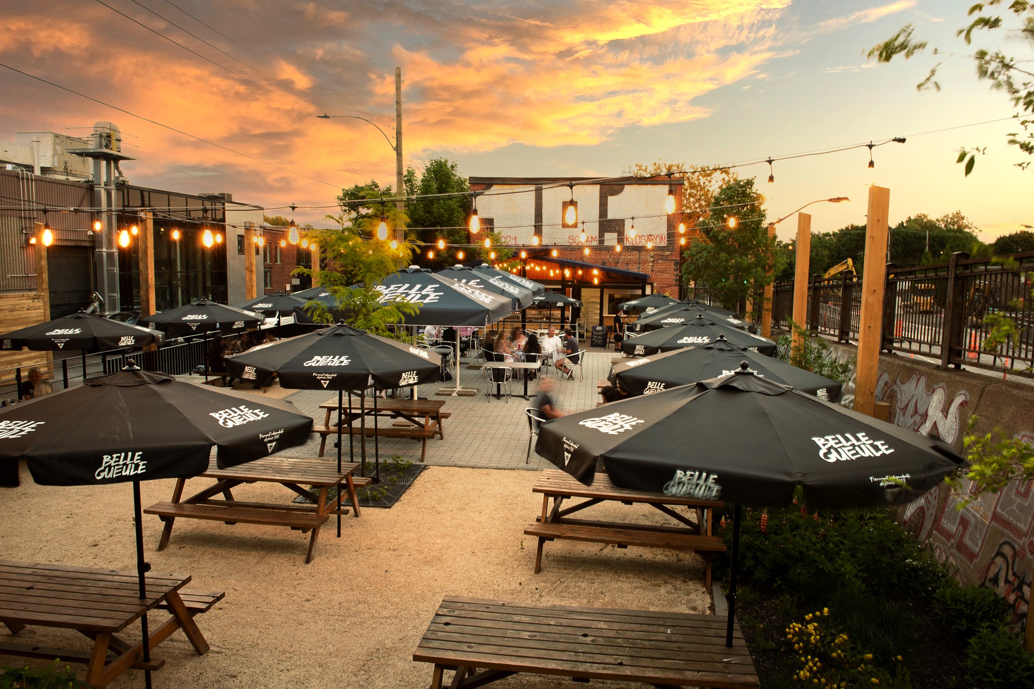
Once the classic range had been relaunched, Cohésion collaborated on the design of the Exploration series. Belle Gueule, in response to consumers' thirst for innovation, launched this range of unique brews from Quartiers Belle Gueule, the brand's nano-brasserie and resto-pub. The distinctive visual platform for the packaging was developed and designed by Caroline Reumont Design. It infuses dynamism and modernity to the brand, while consolidating its urban, trendy look.